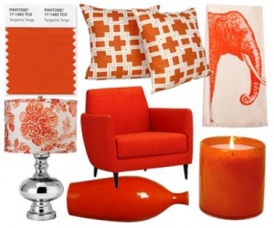
 Orange, orange everywhere in 2012 Boring and sometimes depressing is the best way to describe traveling on the West Kentucky Parkway.
This is the case especially in winter, when all leaves are gone. In full view are the thousands of dead trees from the two massive regional ice storms of the past three years. Most times, these views of destruction are framed in tones of dull browns or grayness.
No colors to take away the feeling of depression as you travel pass the dead trees.
On a recent trip to Frankfort, I stopped at the rest stop at Beaver Dam, Kentucky. This is one of those mile markers that travelers use to measure their trip. Gas, food, drink, and restrooms that breathe life in a lonely spot in the middle of rural Kentucky.
The rest stop did sport one national brand for food. There is an Arbys.
Arbys is the restaurant of choice other than the fast food snack bar of the small convenient mart. So after about 140 miles that day, I was looking forward to taking time out at Arbys.
Getting my order of Roast Beef sandwich and curly fries I retired to a booth and enjoyed the meal. Food consumed I lean back into the booth and just relaxed for a moment. Just as my mind turned off the demands of the trip, I suddenly became aware of a new bright color in my personal space. The color was orange.
Sitting in front of me was (1) small orange box of fries, (2) medium size orange drink cup (3) and a orange place mat filled with the theme, It’s GOOD MOOD FOOD. All of this was placed on a backdrop design of small multicolor rings straight out of the late 1950’s and early 1960’s.
The personal advertising worked! I leaned back and thought of those long lost years of being young and carefree. Arbys had done their research well.
Now some weeks later, I have had time to do a little research myself. So far, 70% of all TV commercials have some form of the color orange in them. Some corporations used the color more than the rest. A T & T Telephone is one of the heaviest users of orange.
So the more I think about it, the more I realize that colors are an important part of our capitalist world. Yet, we trend not to understand or notice how color impacts our lives.
Color for most of us is an invisible feature of our daily lives. Each day we move within a familiar bundle of surroundings. Our daily geography is home to a rainbow of reds, blues, greens, and yellows.
Yet, each work day, we go to work. We travel down familiar paths. We sit at the same desks or work stations. We look out to the same views. We trend to travel into the same online worlds.
This is our world and in many cases, we see not the true beauty of color in our lives as much as we co-exist with the sublevels of colors as market drivers. Somewhere deep in our brain is a command center that puts us into an automatic trance. We move only interested in getting from point A to point B.
We move from desk to hallway to front door of office without really seeing the art or colors of our surroundings. The same action occurs when we go in a car to lunch. Our brain targets the road and we focus on the dynamics of moving along the road.
This would work well if we still lived in a hunter gatherer world. But in a true capitalist world, we are directed to places by the use of logos, slogans, and colors.
Reds point to action or bold statement of message.
Blues and greens tell us to relax.
Yellows allow us to be funny or happy.
Last year in 2010, hot pink was the go-to hot color for all of us to love. Just think of the cell phone ads with the young woman in hot pink.
But according to the Pantone Institute of Color, Tangerine Tango is the newest base color for 2012.
Say goodbye to last year’s hot-pink hue Honeysuckle. And say hello to Tangerine Tango, a reddish-orange hue that Pantone announced as the top color of 2012. This color is already making its way into consumer products from fashion to furniture and kitchen products.
Why Tangerine Tango?
According to a news release from Pantone,
“There’s the element of encouragement with orange, it’s building on the ideas of courage and action, that we want to move on to better things. I think it would be a disservice to go with a relaxed, soothing color now,” said Leatrice Eiseman, executive director of the Pantone Color Institute, the research division of Pantone Inc.
Selecting Tangerine Tango is not an arbitrary choice. Pantone takes into consideration what shoppers want and need. Also, they look at everything going on in the world from fashion to pop culture and consumer habits.”
Orange was last used in the 1920’s, 1960’s and 1980’s as a color to make people to feel uplifted during difficult social times in America. The color has a subconscious message of strength, courage, action, and good mood feeling.
For fun, watch the next twenty TV commercials and count how many times the color of orange is located within the commercial.
Now consider that Obama will spend a billion dollars as will the Republicans on Election 2012. Starting around Fancy Farm Picnic (August 2012) day and night will be 2 billion dollars of commercials with orange in them to make you feel good about “Whatever” in the political world in addition to the millions of dollars spent for just plain consumer driven ads.
Like it or not, you and your family are being directed by colors of large corporations and political action committees (PACs).
Welcome to the 21st Century World of Mass Marketing 101. |


